Role in Research, Sketching, Wireframing, prototyping, Testing, Branding
Nowadays, having a mobile online shopping app is a trending way for businesses to give convenience, efficiency, and more control to consumers. Because of competition, a significant challenge for the retailer is how to get more consumers and also retain them. Zara is one of the largest retailers that specialize in fast fashion has so many products under it, offering an amazing online shopping experience for customers.
As a big fan of Zara’s product, when I use the app on my IOS phone, I’ve noticed some of the unfriendly usability issues that might weaken users’ shopping experience. Consequently, I decided to redesign the ZARA phone application for a better user experience.
Project Overview
The Goal: Re-design the category and review system workflow to create an easier, effective and more friendly shopping experience.
The Challenge: Zara is a very popular fashion brand in the world, and so many people like to shop there. A fluid shopping experience will uplift their mood which potentially makes customers buy more products. Consequently, ZARA is facing how to prioritize the content of the app.
The Role: Research, Sketching, Wireframing, prototyping, Testing, branding
Tool: Adobe XD, Adobe After Effects, Adobe Photoshop, Pen&Paper
Device: iPhone
User Research
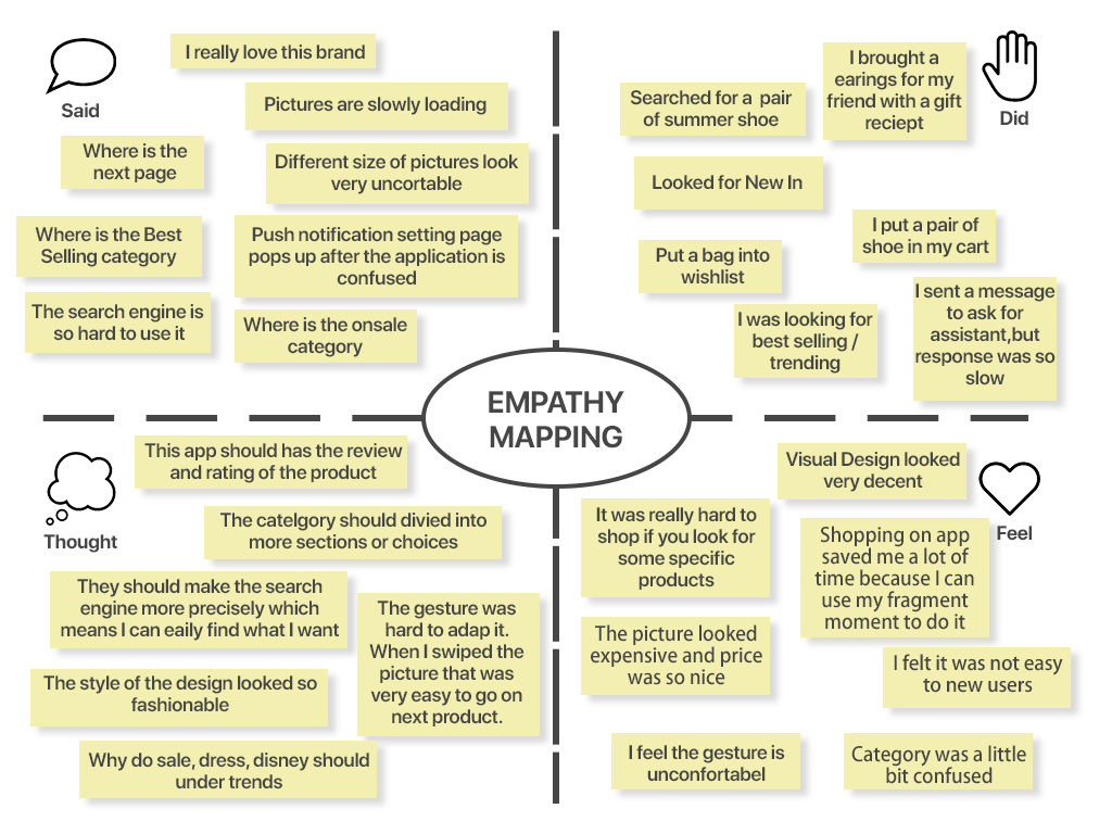
Conducting interviews with friends and strangers who are young, price-conscious, and highly sensitive to the latest fashion trends. After interviewing, I made an empathize map to establish a persona.
Conducting Research Interview Plan – Extract information from users for user experience understanding, usability understanding and ideation
Purpose
The purpose of this study is to find out how our target group uses the ZARA IOS app. When, where, and how users use the app in their daily lives may all affect their overall experience. I need to get an understanding of this so that I know what solutions would be most relevant and helpful to our target group.
Method
I will do 10 contextual interviews with people who are young, price-conscious and highly sensitive to the latest fashion trends and show me how they think and feel about the app.
Participants
Participants will be people aged 25-45 who want to have fashion outfits with better prices and to have better experiences with mobile shopping. Since I have 20 days to carry out the study I will ask people from the local area through networking and posting on social media.
Location
I will do the interviews in a cozy coffee shop. I want interviewees to feel relaxed while doing the testing, and I can see their outfits as well.
Empathize – Research and discover how users’ feeling and thinking
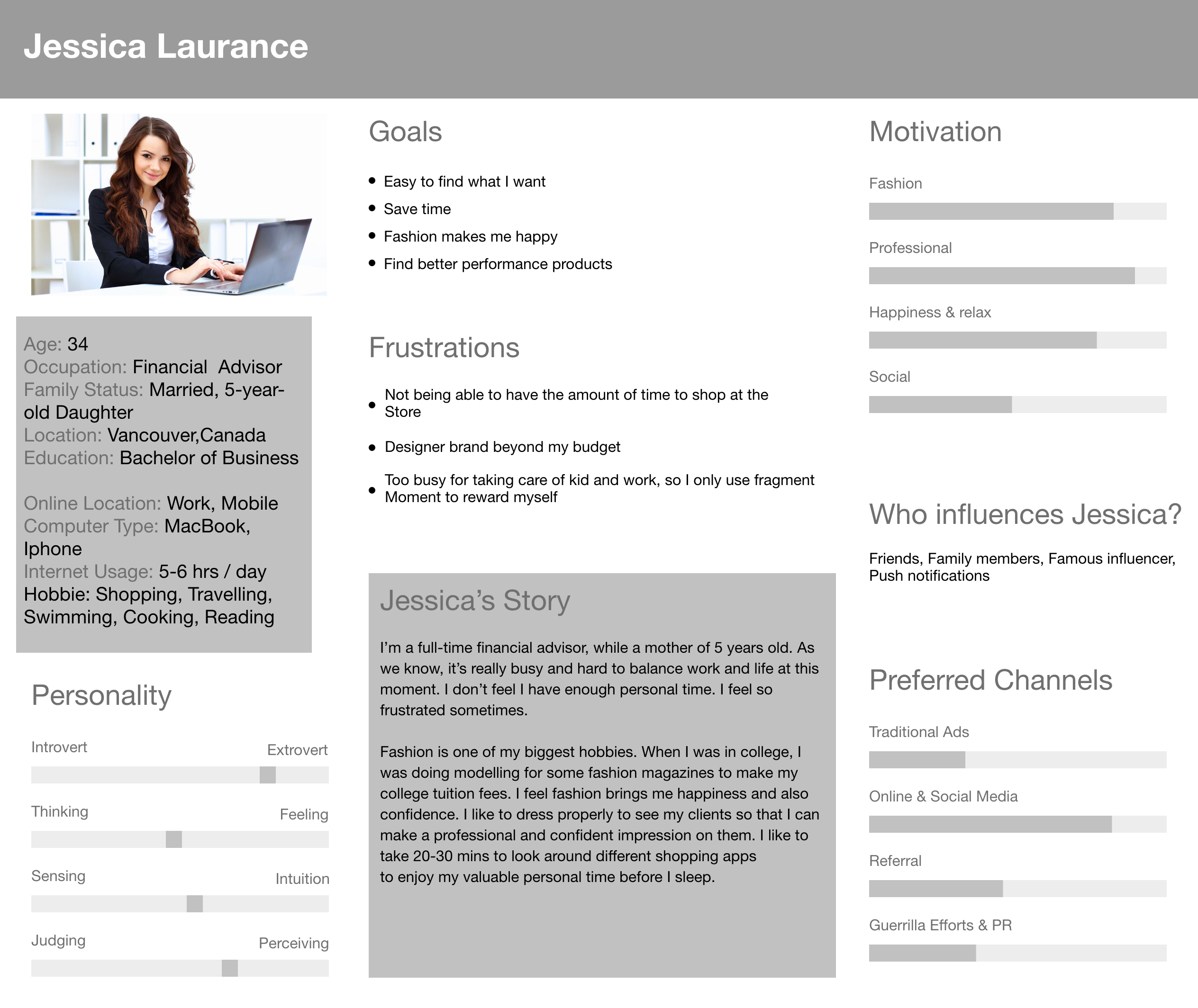
User Persona – Identify users’ behaviour and goals
According to the Zara Retailer report, the target market is women (here only discuss women), 18-40 years of age who are very fashion-forward and trend-conscious, residing in an urban area. Zara’s customers are definitely sensitive towards having the most up to date and fashionable clothing and accessories but at an affordable price. In addition to my previous result, I have created a goal-directed persona for the Zara ios app users.
Define
Creating a point of view problem statement to understand users’ needs and insights
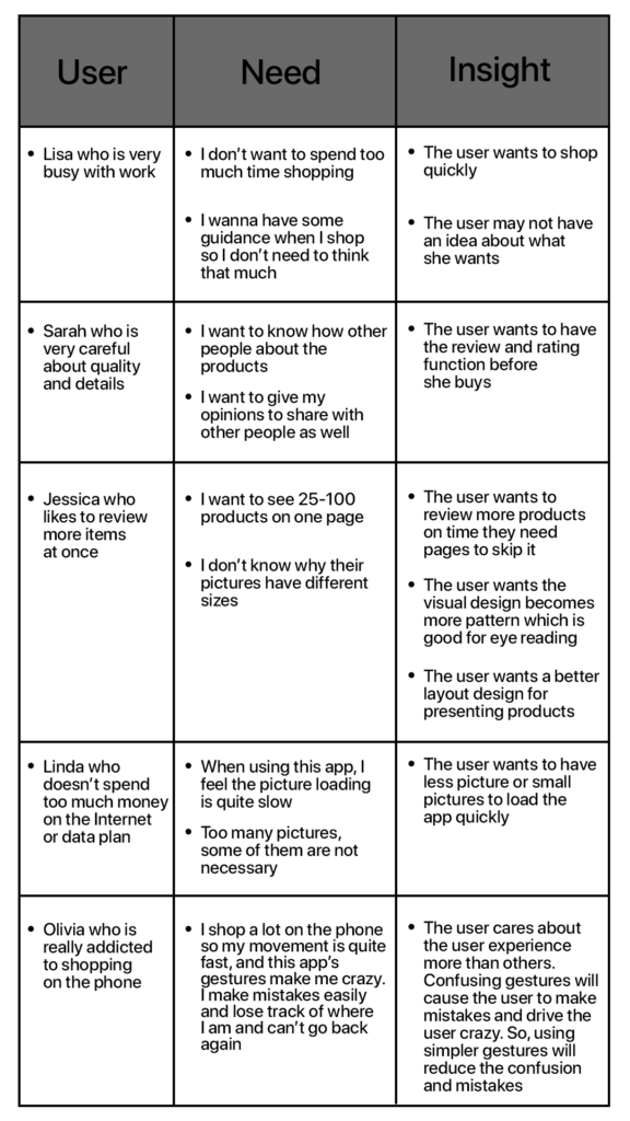
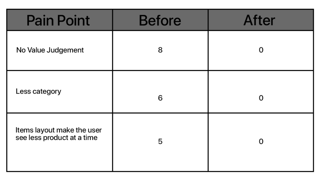
After reviewing with typical users to analyze, I have made three main pain points to improve on as below:
Pain Point 1: No Value Judgement
Most of the users were having a hard time deciding to buy the product or not because there was no judgement. Therefore, the review and rating system is quite important to make users buy the product without hesitation.
Pain Point 2: Less category
According to my research and point of view statements, we have realized the users want to have more categories to access instead of spending more time browsing. In addition, adding more useful categories give users other choices and directions.

Pain Point 3: Items layout make the user see less product at a time
Most of the users want to see more items at the same time, which saves time and is good for an eye scan. Therefore, the layout of pictures or products is a waste of users’ time.
Ideate
Based on our research and define, I made some improvements to develop better user experience.
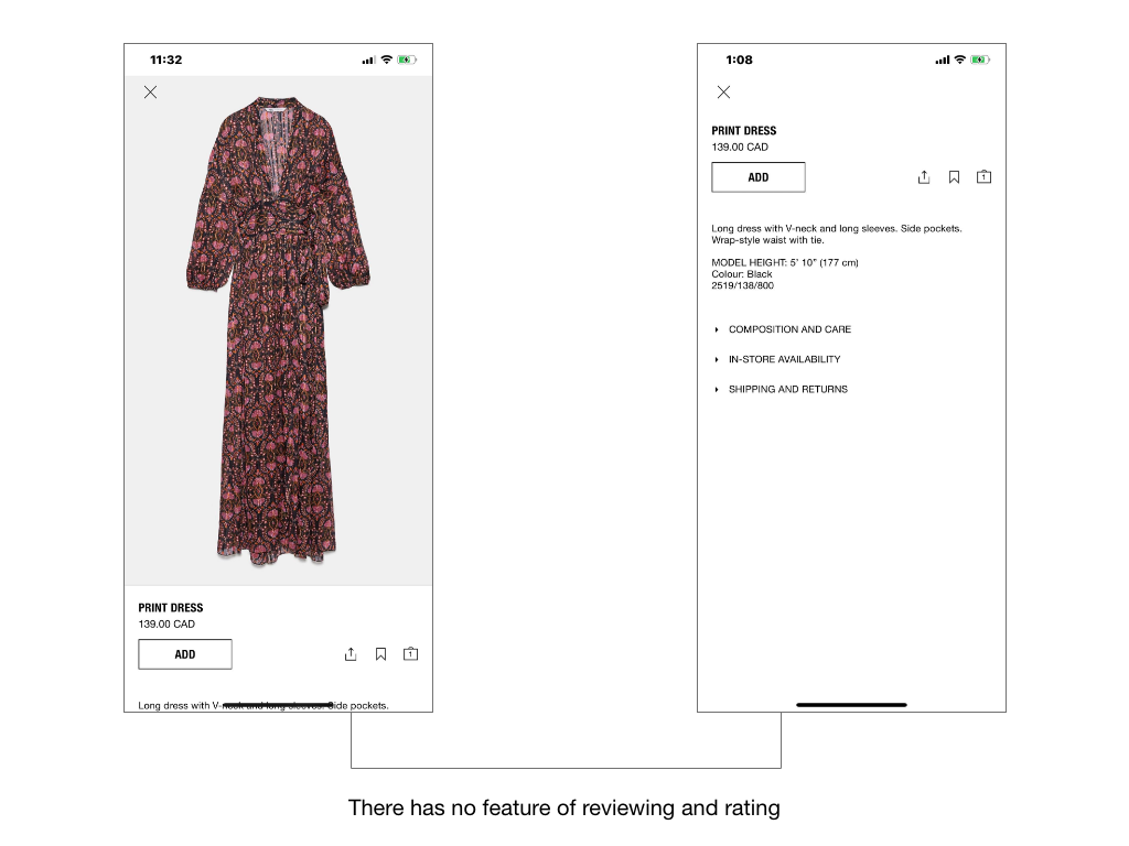
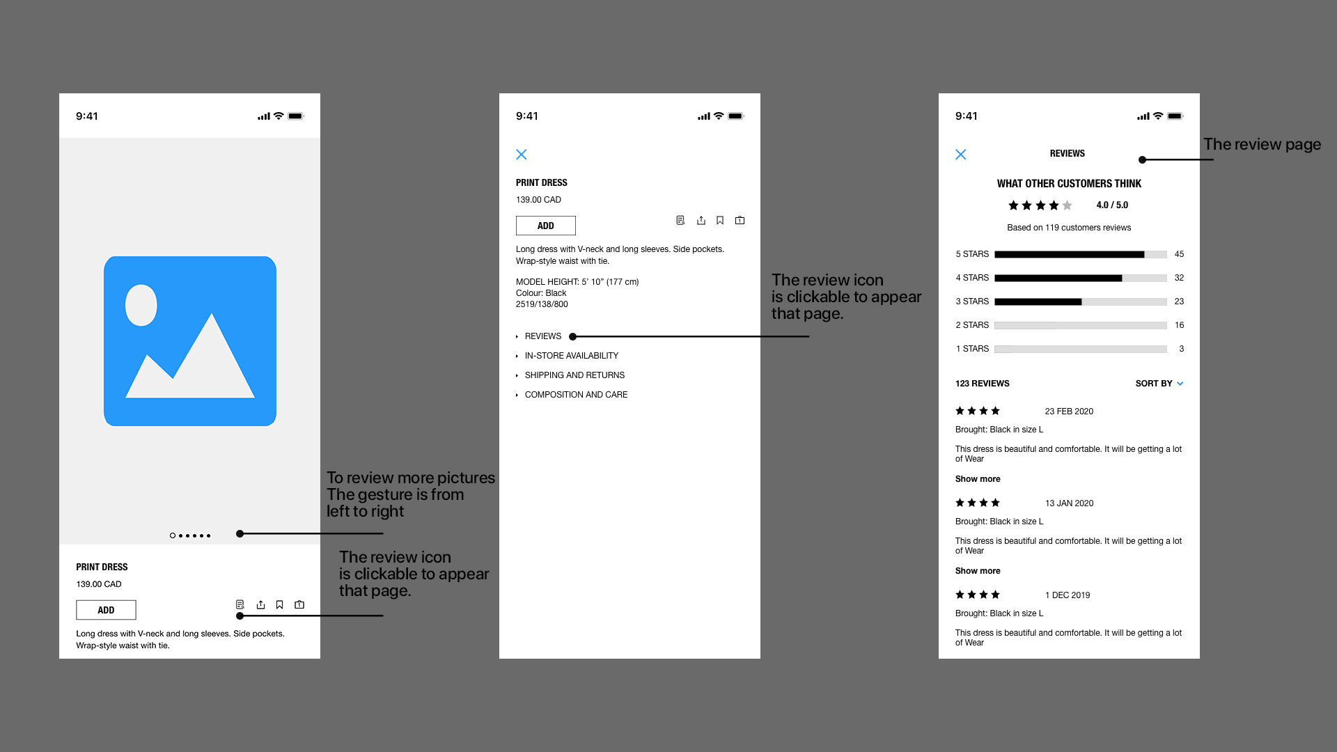
Pain Point 1: Add the review function to the app
The original design was simple and decent, but it lacked the reviewing system. Therefore, I added the review icon and more details for giving a value judgement for users. I brainstorm and sketch to address those details as below.
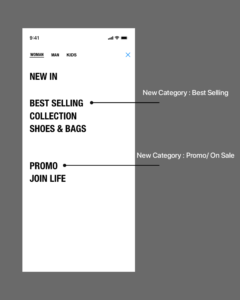
Pain Point 2: Put 2 more categories including Best Selling and Promo
As we know from the point of view statements, I was dedicated to customer satisfaction to meet their different needs and requirements. Therefore, I added two more options that were Best Selling and Promo to improve user experience needs.
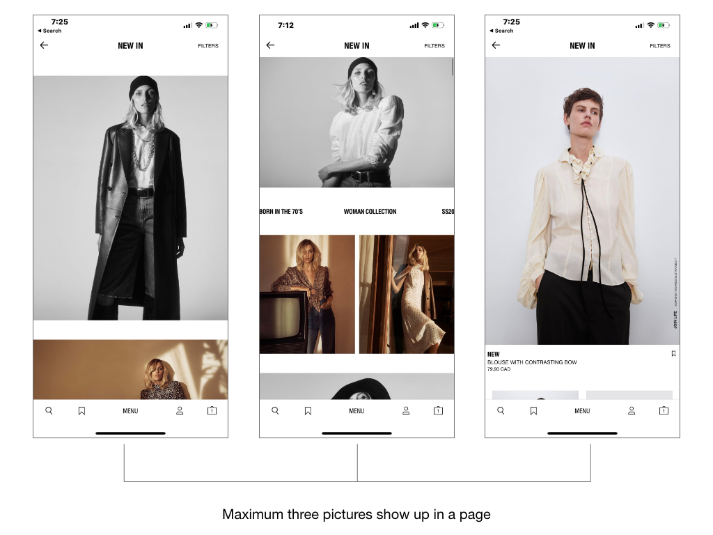
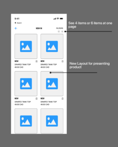
Pain Point 3: Changed the layout of the pictures to present more than three pictures on one page.
Most of the users desired to see more than 3 pictures on one page to improve the speed of scanning and discovering. Therefore, I designed a new layout to provide a new visual to satisfy their needs.
Validation
Conducting user testing with a group of users has allowed me to identify and resolve the pain points, and the results were positive:
- Users had no hesitating to purchase products because of the reviewing system helped a lot.
- Users had more categories to browsing products and better direction to guide.
- Users could see many pictures on a page instead of scrolling down often that improve a lot of user experience.
Prototype
Based on the wireframes and user testing with the same 10 people, I made a Hi-Fidelity prototype to represent the final result.
